Hi @DeSocialWorld I find great discomfort when I have to select the three-point menu. Visually it's unbalanced compared to the previous square icons, and most of all it's really annoying to select it comfortably with the mouse, because there is only a margin of two pixels.
So I make my proposal: could you please align a new menu with 3 large icons, easily selectable as I show you in the attached image? Thank you
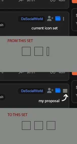
Hi @DeSocialWorld
I find great discomfort when I have to select the three-point menu.
Visually it's unbalanced compared to the previous square icons, and most of all it's really annoying to select it comfortably with the mouse, because there is only a margin of two pixels.
So I make my proposal:
could you please align a new menu with 3 large icons, easily selectable as I show you in the attached image?
Thank you