@iodacasamia
853cb7d2bf26fab4105d27064911fe7078ad4f383fa1fb4aed4f1f36cde9cc94Sep 8, 2024, 09:18:04
Hi @DeSocialWorld
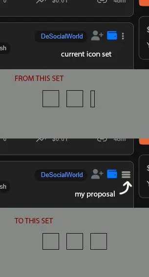
I find great discomfort when I have to select the three-point menu.
Visually it's unbalanced compared to the previous square icons, and most of all it's really annoying to select it comfortably with the mouse, because there is only a margin of two pixels.
So I make my proposal:
could you please align a new menu with 3 large icons, easily selectable as I show you in the attached image?
Thank you
0
0
0
6
Calculating...