@RobertGraham
8c1517bc79110386034684270c6f1ab27688e955efcac0763485af4788f6d385Feb 15, 2025, 20:40:06
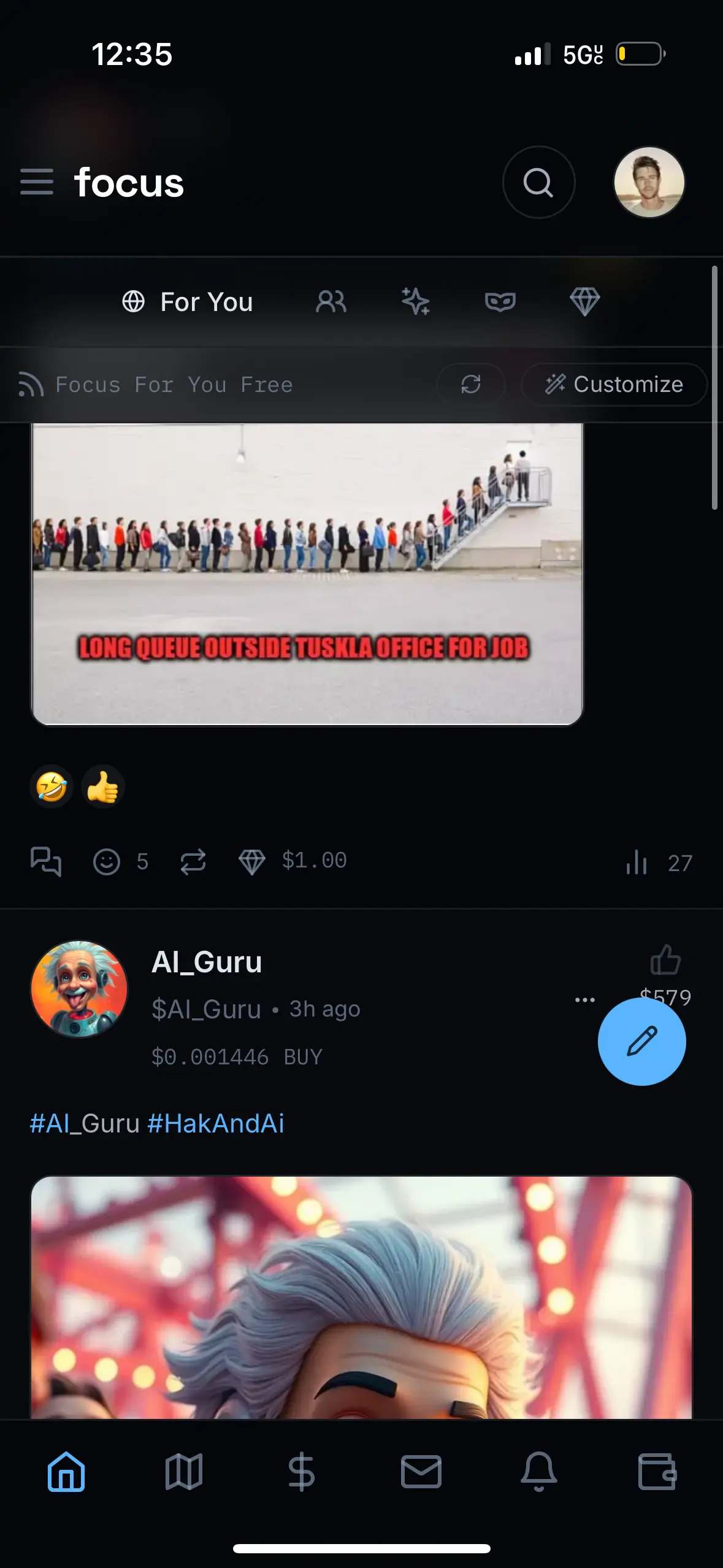
I know this isn’t a top priority, but I think simplifying the engagement buttons below posts would make the app much more intuitive (for me anyway). A layout with just comment, like, re-focus, diamond and the view metrics evenly spaced below the post would be way easier to use. Right now, it feels a bit cluttered to the left, I personally don’t care for the associations and I didn’t even realize views were there until a few days in because they were far off to the right.
Just my opinion and throwing it out there.

1
1
0
@DiamondThumb
3613552dbb8f8256d412c1508cbcdfcee37dc5aa362fe46df824585d60e8f31cJul 11, 2024, 21:30:39
bounty ???
the quicker picker upper lipper
0
0
0
1
Calculating...
@mcmarsh
7363d6d2408fd03429ab10899177b03e81b351558dc92c96210ab63ecfc5aaa8Jul 12, 2024, 17:45:47
Resolved after communication
Or you have tested the hack and it's fixed ?
1
0
0
@mcmarsh
6026e89295f212e5217149503ecd899a41612e310e1bae53bef64e431223c1d2Jul 11, 2024, 22:13:43
1
0
0
@mdmahmudulhasan
0a1c3574406ca8edcd140b576ab25e3c3a24c8d603d489f421d7111ff5cf9890Jul 12, 2024, 04:36:56
😳 you're something else brother ❤️
0
0
0